16.06.2026
Home decor can be quite a challenge. Among the number of things that we need to plan during renovation, there is one that we spend the most time on. Choosing a color palette for a room keeps some people awake at night. However, there are a few simple ways to choose a color scheme for your space. We advise on how to choose colors for the room to create a friendly atmosphere in the interior.
We present the basic meaning of colors that should be taken into account when choosing the right palette. We will check which shades will have a beneficial effect on our well-being, and which on the contrary.
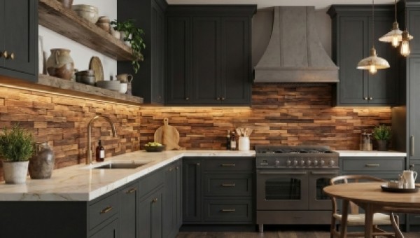
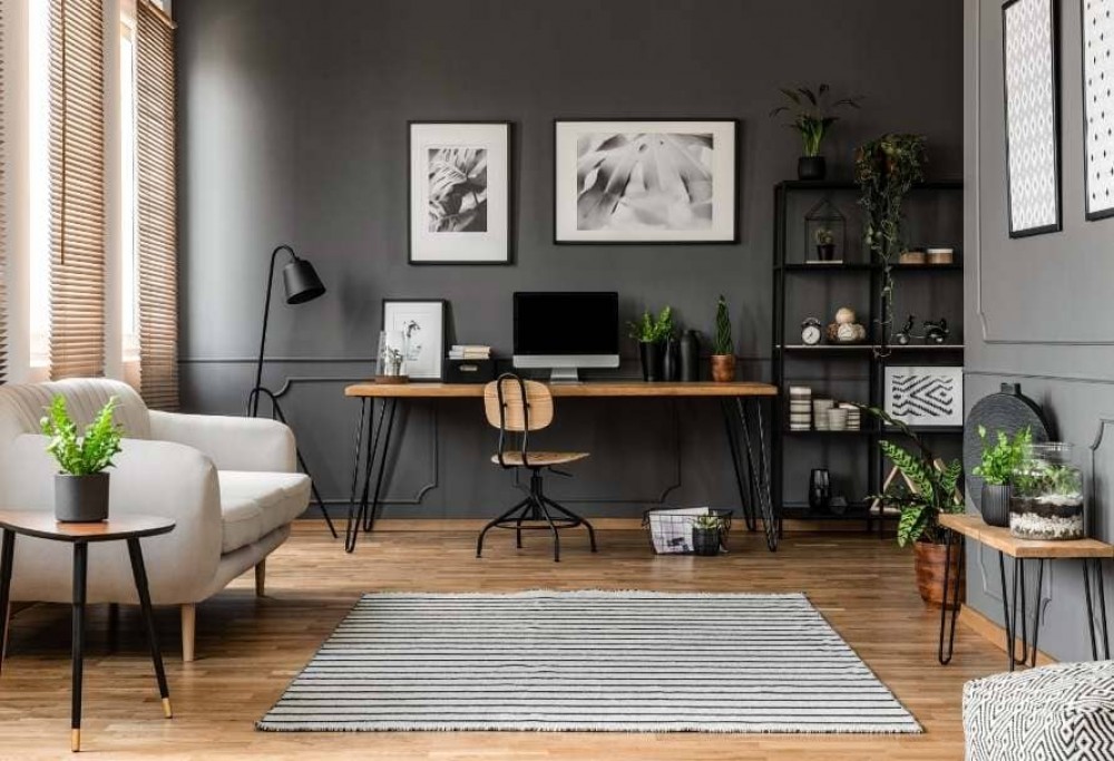
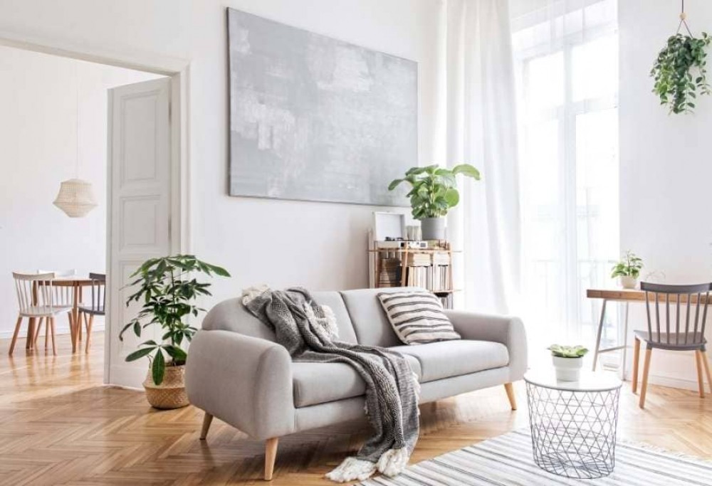
The 60-30-10 rule is a standard rule used by designers to help create the perfect color palette for the interior. It is assumed that 60% of the space should contain one dominant color, 30% of a secondary shade or texture, and the last 10% are additional accents.
How to use this rule? 60% is the background color, it is the color of the space that will dominate the interior, and thus will be the perfect setting for accessories. The following colors are excellent: white, gray, cream, beige or pastels. These 60% will include, among others, walls, carpets and furnishings.
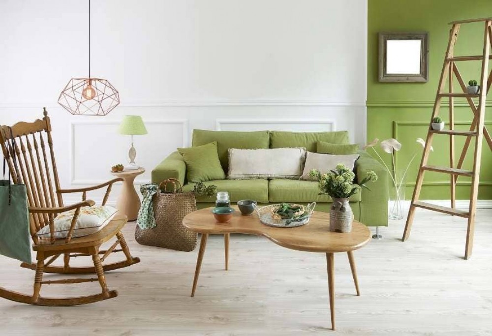
30% is a color that will support the previous tones, but also attract more attention than the previous one. Your creativity belongs to 10%. This part includes your color accent, which may include intense variations, or the more subtle, e.g. earth tones. This is all that will add character to your space.
The easiest way to create the perfect interior color is to use the color wheel. You don't need any special education to create your perfect diagram, you just need to understand the basics of this theory.
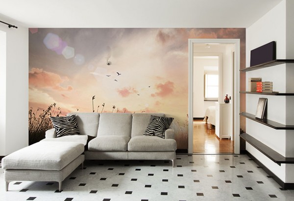
Monochrome colors - choose only one color, using lighter and darker shades in the space. Natural colors will work best.
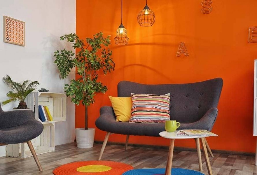
Complementary colors - This scheme takes into account two colors that are opposite to each other in the color wheel. This combination will be a mix of warm and cool colors, because they are on opposite sides.
Analogous colors - this is a method of selecting three adjacent colors, one of them being the dominant one. This pattern is often very harmonious and relaxing. An example of such a solution can be e.g. blue-green, green and green-yellow.
Triadic colors - this is a scheme that is also based on three colors, including the dominant one. In this case, the colors are evenly distributed around the circle. When selecting colors using this method, pay attention to their saturation.
Tetradic colors - in this case we are focusing on two sets of complementary colors. Working with four colors can be more difficult, but it gives really amazing results. There are several ways to use this schema. We can choose, for example, one dominant color and 3 accent colors, or use only subdued colors.
You can easily experiment with all these schemes until you finally find the right combination for the interior. Thanks to this, you will not worry whether a canvas painting with a forest motif or an abstract wallpaper will fit better on your wall.
If you feel up to it and believe that this rebellious change will look great inside, then go for it! Combine with percentages, set your own scale, e.g. 60-30-10-10 or 40-25-15-10-10. First of all, it is an interior created with you and your needs in mind. You are to feel great in it.